End-to-End Health Website Redesign
The Project
- Client
Oral Health America - Categories
Web Design, UX Research - Dates
Jun 2016 - Aug 2017
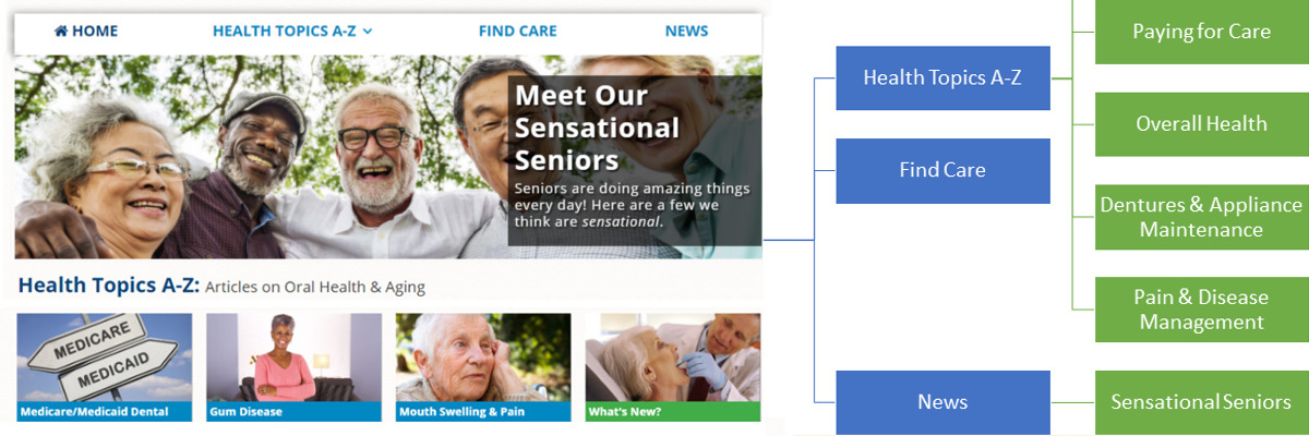
Oral Health America's consumer-focused website, toothwisdom.org, offers articles about oral health in aging and provides a tool to help seniors find locate local, affordable dental care.
I had inherited management of the website in 2015 and noticed several areas that I believed could be causing poor user experience online (for example, the website was not mobile-friendly).
To bring our users into the design process, I began collecting data about how seniors use technology and, more specifically our website, through a variety of user research methods including an in-person usability test and paper prototype of the proposed design. The revised toothwisdom.org launched in August 2017.
Project Goals
-
Build an excellent experience for both mobile and desktop: The website had been launched by a 3rd-party vendor with a desktop-focused design, offering a poor mobile experience.
-
Improve website usability and accessibilty: A heuristic evaluation demonstrated that toothwisdom.org did not meet some common usability practices, and my 2016 Usability Study confirmed that many seniors struggled to complete desired tasks.
-
Reduce ongoing maintenance costs: The vendor had restricted Oral Health America from making changes to toothwisdom.org; even requests for minor website changes resulted in hefty service fees.
-
Establish a viable content management strategy: Toothwisdom.org had over 4,000 web pages linking to oral health websites from all 50 states, many of which contained broken links or out-of-date information. The new website needed to have a moreviable management plan given the organization’s very small staff.
Stakeholder Interviews & Historical Review
About a year before relaunch, I assigned one of our summer interns to interview the stakeholders of toothwisdom.org, past and present. These interviews helped us understand why the website had been built and whether we were making good on its original promise.
While the interviews were underway, I completed a review of past environmental scans, proposals, wireframes, and project contracts to understand the history of toothwisdom.org from an organizational and development life cycle standpoint.
Usability Testing With Seniors On Toothwisdom.Org
Having a team to help generate ideas and troubleshoot problems is a resource I find invaluable for building better experiences online. As with my approach to Building a UX/Web Strategy Team As a Department of One, I formed a usability testing team for comprised of the Program and Communications teams; our purpose was to learn what our users were trying to do and identify pain points in their process to avoid repeating similar mistakes in the redesign.
After reviewing the background information with the team, I led a brainstorming session to help us create usability test scenarios (and supporting tasks) that reflected the activities we wanted seniors to be able to complete on toothwisdom.org.
Sample Testing Materials


We secured a location at a senior center where we could conduct a usability study with 8 of the seniors there. I trained our note-takers on how to take useful notes in that context and how to ask probing questions without leading or shaming the participants.
I moderated each of the 8, one-hour test sessions while my two interns observed and took notes. After the team had debriefed and I'd written up our results, the interns presented the usability study outcomes to the full staff at Oral Health America.
Making Data-Driven Decisions: The Planning Process
The usability study exposed several areas where toothwisdom.org could improve, many of which I was able to incorporate into the final redesign:
-
Increase the size of the website text
-
Stop content (both images and text) from changing/moving without intentional interaction
-
Have low-cost dental clinics searchable by city or zip code, rather than listed by state
-
Simplify language in the health-focused articles
Other outcomes needed additional research for us to learn the best path forward:
-
Simplify pages and decrease number of asks. Q: What should our main asks be?
-
Remove small UI components that are difficult to interact with. Q: What UI would serve our users better?
To answer these questions, I conducted two surveys: one displayed as a small modal on toothwisdom.org for our current users, and another delivered via Google Surveys targeted at Americans above the age of 65 living in the U.S.
My first survey asked about the nature of who our users were (which we confirmed were mostly older adults above the age of 65) and what they were trying to accomplish while on the site. The verdict? Most were trying to find affordable dental care.


My second survey asked more narrowly about language and preferences, such as what articles someone might like to read about or what words they would use to describe the connection of your oral health to the rest of your body.
All of this research, along with understanding some the best practices when designing websites for seniors, helped me plan a redesign of toothwisdom.org that was specifically tailored to our users and manageable by our small staff.
Wireframing / Paper Prototyping
After building some low-fidelity wireframes, I held a smaller user study with a paper prototype of the redesigned website and a handful of seniors from my family’s church.
Toothwisdom.org Paper Prototypes


At this stage in the process, I had hired a developer to build a searchable database of affordable dental clinics—the functionality was there, but we had not yet fleshed out the UI. The paper prototype study allowed me to test out some design concepts and avoid the costly mistake of building a tool that no one could use.
A notable (and slightly embarrassing) lesson from this study occurred when I asked the seniors how they would go about finding "affordable, low-cost dental clinics." Most of them replied they would Google it. The primary cause was that nowhere on the toothwisdom.org mockup was there any mention that the search tool was specifically for low-cost dental care. I added language for the production launch.
Encountering Barriers
Between the time of the paper prototype and website launch, I had planned to do both an unmoderated user study on a working wireframe of the new design, as well as a full, in-person user study so that we could compare outcomes to the one we'd done previously.
However, the tool I had intended to use for the unmoderated study changed their pricing structure in the middle of our process, making it too expensive for a nonprofit organization’s budget.
When it came time to complete an additional usability study, we had cancellations by not one, but three separate retirement communities (and with them, the cancellations of all the seniors who lived there).
Not unusual for projects such as these, but we still had to launch.
Even though this hiccup was not ideal, the data-driven process I had led (and the knowledge that we would have opportunity to research and revise later) made me confident that the new website provided an improved user experience. And so, with a plan to complete additional user studies in the future, I launched the redesign of toothwisdom.org design in August 2017.
Outcomes
- Mobile use up 33%
- Users up 15%
- Search traffic up 10%
Based on Analytics data comparing 6-months before & after launch
Shortly after launch, the website HealthWeb Navigator ranked the website’s usability as 4.5/5 and published the following review of toothwisdom.org:
“Tooth Wisdom is recommended as a great introductory resource for learning about the intersection of old age and oral care.”
Internally, we had simplified our management process by migrating those 4,000 clinic pages to an online database that could be queried by location or clinic type. This change had the added benefit of being searchable on the front-end by users (a requested feature in early user studies). I found it incredibly gratifying that we had built a tool that was both user-centric and easily manageable in-house.
Before/After: Information Architecture


Before/After: Homepage, On Load


Before/After: Find Affordable Dental Care


Before/After: Health Resources > Health Topics A-Z

